METHODIST WELFARE SERVICE REBRANDING
The logo comprises two elements – the symbol and the wordmark.
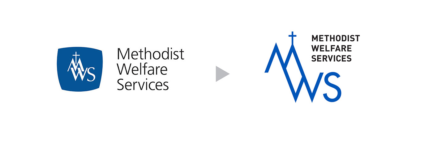
The Symbol
The letters M and W form the outlines of peaks, troughs and pathways that depict the challenging journeys that we take with beneficiaries, serving them through our integrated network of services.
In transforming lives and making a social impact, we will be Christ-centred, symbolised by the cross standing on the highest point of the logo.
The logo is also reminiscent of the church steeple, and embodies our role as the social concerns arm of the Methodist church.
The Wordmark
The typeface showcases clean and bold lines, which give the logo a modern and stylish aesthetic. The blue palette has been preserved to retain MWS’ heritage, but is brightened to stand out more.
Colour Palette
The blue colour palette has been preserved to retain the brand’s heritage and equity. At the same time, a brighter hue of blue makes for a more energetic corporate colour and impactful logo.


Creative Director: Thomas Yang
Design Directors: Choo Wai Kuan, Thomas Yang


